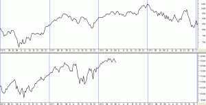
Stock markets are known to follow certain time cycles with one of the most notable being the ten year or “Decennial Cycle”. The famous stock market trader, William D. Gann applied it to his trading strategies as long ago as the 1920s. And today market technicians make great claims for the decade cycle calling it a “Road Map” for the Stock Market which repeats every ten years.
It is not my intention to explain the whole of the theory here, merely to highlight the importance of a year ending in “2” in each decade and to include examples to show you how successful the cycle has been as a forecasting tool for that year.
Historically, the most frustrating and difficult part of the ten year cycle has been the period leading up to the middle of the “2” year. Each cycle starts at the beginning of each decade and so the period from the start of the “Zero” year, e.g. 2010 through to the middle of the “2” year, e.g. 2012 is often a period of choppy markets making it difficult to make money. However, this part of the cycle ends when a market low is usually reached somewhere towards the middle or third quarter of the “2” year.
The Market Low in the “2”Year
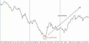
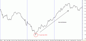
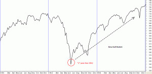
The low in the market during the “2” year is usually the start of a new Bull market rally. Some charts might help to illustrate these points.
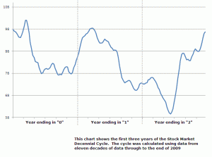
This first chart shows the average performance in the first three years of the ten year cycle. Eleven decades of data (1900 through 2009) were used to create the cycle you see here in blue and the chart shows the average performance of the Dow in the first three years of the cycle based on data from that period. (Note that data from the start of 2010 through to the current date was not used in the calculation). Please click the charts for a larger view in a new window.
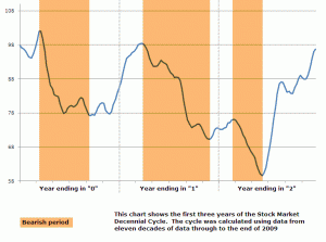
The next chart highlights the bearish periods as shown by
the shaded areas applied to the same chart.
This next chart applies the same shaded areas taken from the average decennial pattern and overlays this on the current Dow Index shown from the start of 2010. Given that we are in the decade cycle from 2010 through to 2019 these first few years of the cycle again appear to be remarkably accurate at plotting the path the market is currently following.
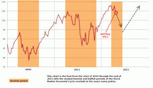
The chart above shows where we are currently located having re-entered another bearish period. If the decennial cycle continues to be an accurate guide we will see an end to this weak period sometime towards the end of the second quarter or in the third quarter 2012. At which point we would enter a bullish period.
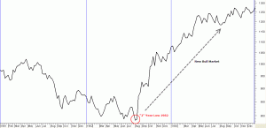
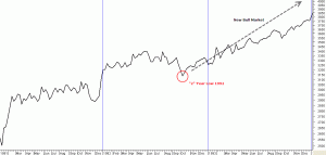
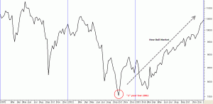
I thought it might be helpful to show charts dating back to the 1930s to illustrate the reliable tendency the market has of making an important low in the second or third quarter in the “2” year. Of course this was not always the start of a major bull market (although most were) as can be seen in the chart of 1970s.
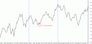
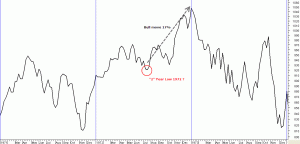
As you know The Chartprofit Market Timing System is currently negative which emphasises the need for caution but it will be interesting to see when the next positive signal is given. I have a feeling it could be a good one but (and there’s always a but) have a look at the following chart. To my eye at least the decade which shows the most obvious similarity to the current one is the 1970s. In that year there was a 17% rally from the “2” year buy point….but then it all went horribly wrong for the next two years.
