from Friday’s webcast:
“Last I spoke about the relationship between Small Cap IWM and the Spyder Large Cap ETF. If you look at the bottom of the chart we have IWM divided by SPY in blue and this is a weekly chart going all the way back to 2000. This is the relative strength line. And at the top we see the thirteen week rate-of-change indicator showing %change of that relative strength line and I’ve drawn a line across at minus 5%.
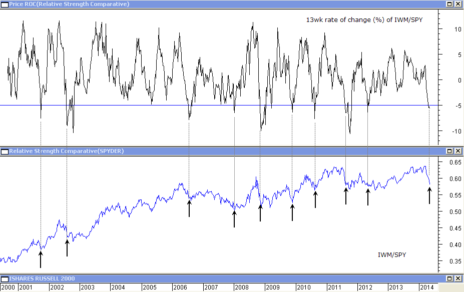
And you can see that over thirteen weeks this relative strength line has fallen by 5%. This doesn’t happen very often, in fact the arrows indicate where that has happened and you can see that usually it indicates a condition of “oversoldness” for the relative strength line and it tends to rally. So what does it mean at those points for IWM itself?
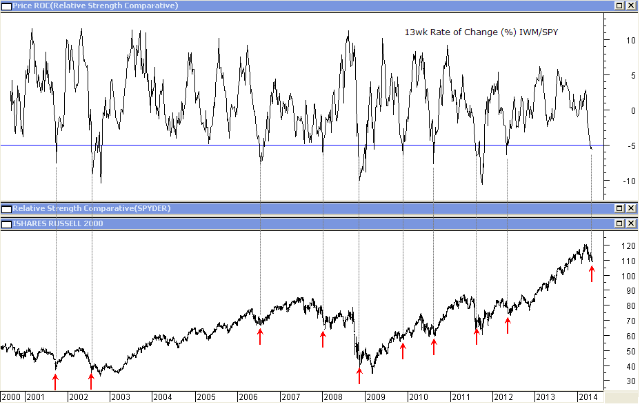
Well on the next chart it shows the same indicator at the top but I’ve hidden the relative strength line. At the bottom you can see IWM, the Russell 2000 ETF, and the red arrows indicate where that thirteen week rate-of-change of IWM/SPY first falls below that negative 5% line.
You can see that when the relative strength indicator has fallen that far, that quickly, at least since the year 2000, we usually see the Russell 2000 and the market rally from that point. So this indicator is suggesting a bounce to come and I suggest that what we look for here is for the IWM chart itself rallying back above 111.48. This is a key chart to watch going into next week.